No products in the cart.

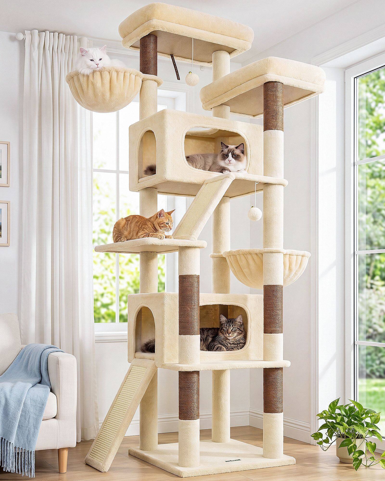
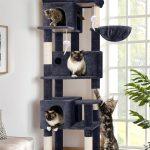
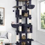
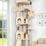
Neutral color systems keep winning for one simple reason: they behave like a background, not a statement. In modern homes—especially open-plan layouts—people want the room to feel edited. A cat tree is large enough to be part of the composition, so the safest choice is often a palette that never fights the sofa, the flooring, or the light.
Design media have framed neutrals as a kind of visual agreement: walls, upholstery, and large objects stay calm so smaller details can change without breaking the room. That logic now applies to pet furniture. When a tower sits in the same sightline as the living room seating, a loud color reads as noise. A beige or soft grey structure reads as intentional.
What changed is not taste alone—it is how rooms are photographed, shopped, and lived in. Lifestyle imagery trains buyers to judge products by the frame around them. A neutral cat tree survives that test because it does not compete with throw pillows, art, or the wood tone on a coffee table. Retail teams notice the same pattern: neutral SKUs move across decor styles without needing a separate merchandising story for every interior trend.
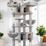
Neutral is a system, not one color. People sometimes hear “neutral” and imagine monotone. In practice, neutral systems are built from texture and tone shifts inside a tight envelope: warm beige with a slightly deeper taupe post, soft grey with a mist tone on platforms, matte surfaces that photograph honestly in daylight. The goal is depth without contrast that steals attention.
Industry Updates conversations also point to a practical side of calm palettes. When a large object ships flat-packed and arrives in a family living room, color mismatch is one of the fastest paths to disappointment. Beige, warm grey, and cream finishes travel across modern, transitional, and Scandinavian-influenced homes because they echo what people already own—linen sofas, oak floors, painted trim in soft white.
Rental households add another layer. When walls and floors cannot be changed, the pet objects become even more visible in the composition. A neutral tower is easier to place beside a landlord-grade carpet or a white painted wall without looking like an afterthought dragged in from a different aesthetic universe.
As furniture-style silhouettes replace novelty shapes, neutral palettes become the default language those silhouettes speak. Honest posts, wide landings, and restrained sisal placement look more credible when the surface palette stays quiet. The structure reads as architecture; the color stops shouting “pet product.”
We also see neutral systems showing up in how families stage daily life. The tower near the window becomes part of morning light in the room; the perch beside the sofa becomes part of evening seating. When color stays calm, those moments feel natural in photos and in memory—not like a compromise someone made for the cat.
At Globlazer, we treat color as part of usability, not decoration. A calm palette makes it easier for families to place a tower where cats will actually use it—near the window, beside the sofa, along the daily path—without feeling they have compromised the room. That placement choice matters: a beautiful tower hidden in a spare bedroom does less for a cat than a neutral tower in the room where everyone actually spends time.
We expect neutral systems to remain dominant because the underlying demand is stable. People want pets closer to daily life and they want their homes to feel composed. Neutral color is how large objects earn both goals at once—visible enough to be used, quiet enough to belong. That is why the category keeps returning to beige, grey, and cream even as micro-trends flash across social feeds.