No products in the cart.

Before Globlazer had a public catalog, we had arms covered in swatches. Choosing our first plush fabric palette was not a color meeting—it was a touch marathon.
We laid samples beside flooring scraps and sofa fabrics owners sent in photos. Beige that looked warm under LED looked pink beside oak. Grey that felt premium in the roll felt thin once stretched over a platform corner. We eliminated quickly.
Density won arguments. Cats knead before they nap; owners vacuum weekly. We favored pile that recovered its shape and did not shine like costume fabric under daylight.
We built a simple scorecard: recovery after compression, pilling after 50 scratch cycles on a fixture, color shift beside white trim at 10 a.m. and 8 p.m. Fabrics that failed any column failed the round—no appeals to “brand mood.”
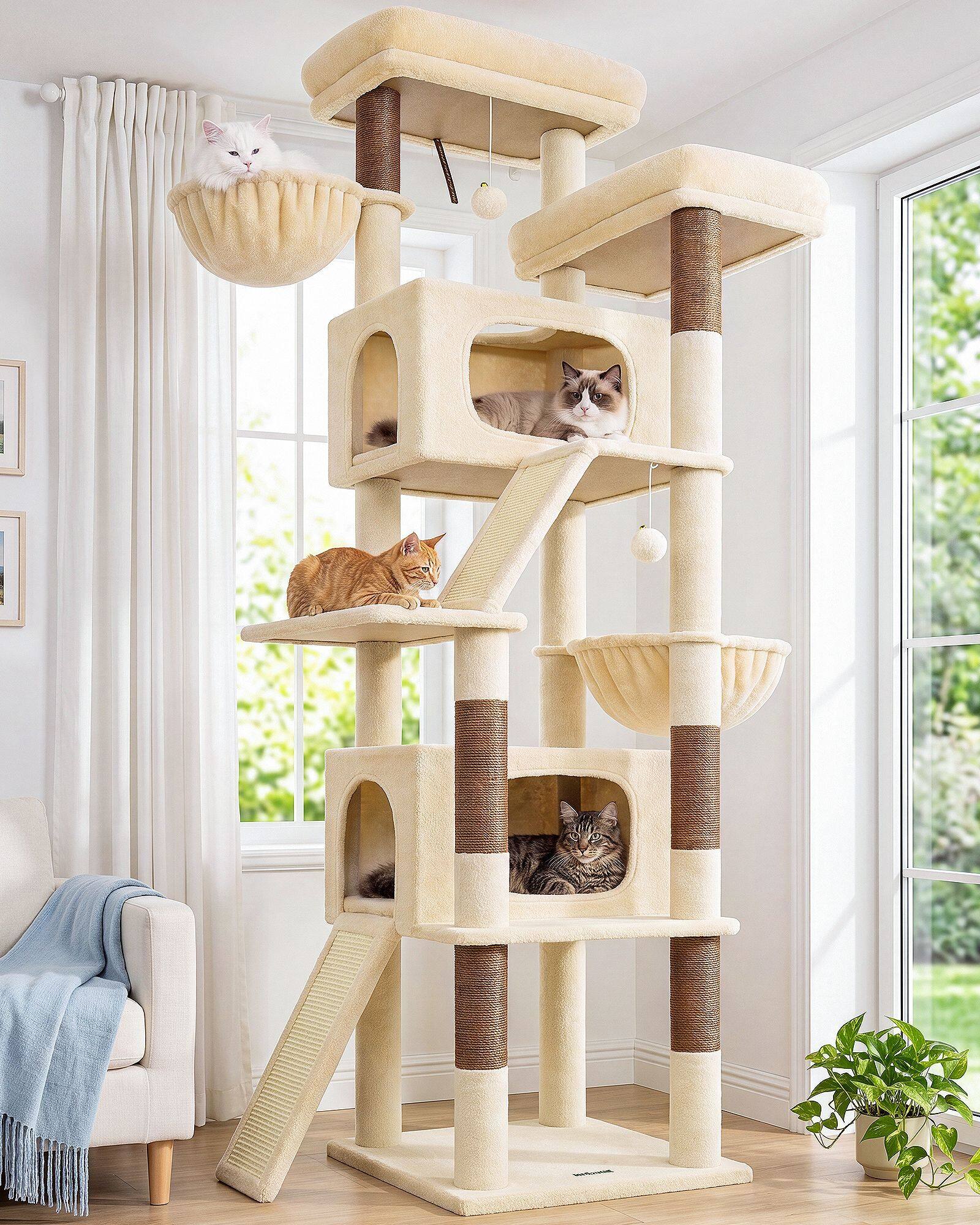
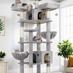
Beige was the hardest. Too yellow and it fought oak. Too pink and it fought grey walls. The beige we kept reads warm in winter light without turning buttery beside North American white paint—the most common backdrop in the owner photos we studied.
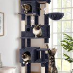
Dark Grey had to feel intentional, not like a default warehouse choice. We rejected shades that read blue under LED or flat under window light. The winner held depth when vacuumed and still looked like upholstery, not gym mat.
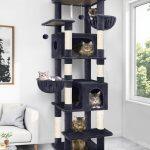
Light Grey became the apartment color—quiet beside bookshelves, honest beside white brick, forgiving when cats leave a season of fur on the nap.
We tested stain behavior with water rings and coffee drips—not to claim performance marketing, but to see which piles recovered after blotting. A platform fabric that holds a shadow stain reads cheap long before it wears through.
Acoustic surprise showed up in testing too. Some piles muffled claw contact pleasantly; others made every knead audible across an open studio plan. Sound is part of home comfort.
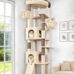
What survived became the direction we still call core: Beige, Dark Grey, and Light Grey. Not because they are safe—because they passed the boring tests that matter after week six in a living room.
We rejected a fourth “charcoal” that looked luxurious in the roll but photographed flat on camera—important for owners who buy after scrolling neutral living rooms online.
Each finalist spent a week on a mockup platform in the sampling area—kneaded, vacuumed, photographed at dusk. The palette we kept still looked invited, not tired, on day seven.
Those three tones still anchor new styles today because they survived touch, light, vacuum, and the knead test—not because they were the easiest colors to order.
We photographed winners on mockup platforms beside sisal—not to sell texture contrast, but to see whether a plush reads inviting when claws are already busy nearby. The palette that survived looks calm from the doorway and warm from the perch.
Fabric selection is where cat trees become home objects. We treated it that seriously from the first swatch—and we still treat every new pile candidate the same way before it touches a platform on a cat tree you might assemble on a weeknight.