No products in the cart.

Retail buyers used to treat pet furniture like impulse color—bright towers that pop on an endcap. In 2024 and beyond, more buyers ask for the opposite: neutral-tone collections that survive open shelves beside sofas, bedding, and storage—not just beside bags of kibble.
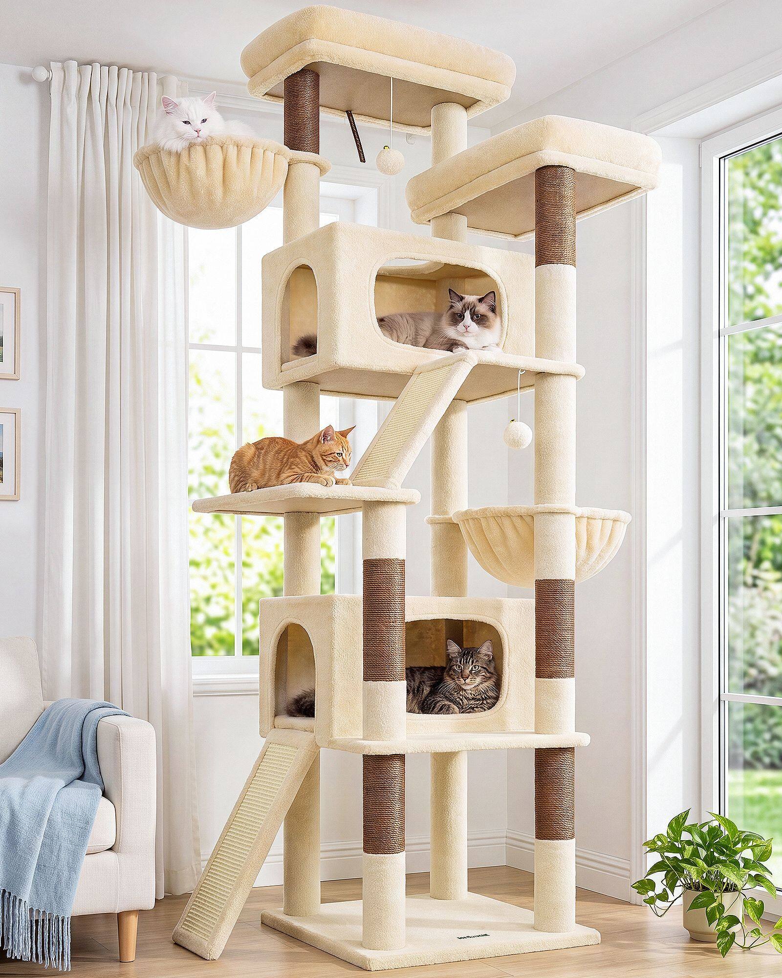
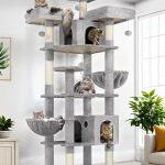
The shift is practical before it is poetic. A beige or soft grey cat tree matches more living rooms than saturated carpet ever could. On a showroom floor, neutrals reduce visual chaos when dozens of SKUs share one sightline. Buyers describe the goal simply: stock colors that do not age poorly when the rest of the store moves toward warm minimalism.
Returns and pre-purchase questions follow color harder than height. Industry Updates observation and our own support patterns align—owners message photos of their sofa fabric asking if a tower will clash. Neutral collections shrink that anxiety before checkout, online or in store. When the default palette already speaks rental white walls and oatmeal upholstery, fewer deliveries end with a mismatch conversation.
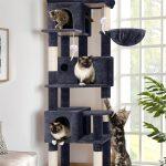
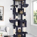
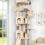
Inventory logic matters as much as aesthetics. BG, DG, and LG assortments travel across regions without betting on one trendy hue. Buyers replenish fast movers without clearing dead stock tied to a color fad that cooled on social feeds six months later. Neutral SKU planning simplifies replenishment: the same trio works in more aisles, more seasons, more customer photos.
Packaging and photography echo the same story. Clean boxes, limited palette graphics, products that read as home goods in lifestyle shots—not only under pet-aisle fluorescent light. Retailers want items credible beside rugs and lamps because those images sell the floor set, not just the pet corner.
Neutral does not mean bland. Two-tone posts, charcoal sisal against mist platforms, and seasonal fabric accents still give buyers differentiation within a calm frame. The collection anchor stays neutral because retailers need a dependable baseline that fits modern interiors by default—then layer personality where it does not risk the whole assortment.
Open-plan housing pushed the preference further. When kitchen, desk, and sofa share one view, a loud pet tower becomes daily visual noise. Neutral towers buy peace: cats keep vertical real estate; households keep a single color story. That trade is exactly what retail buyers optimize for when they plan floor sets for mobile renters and young families.
Omnichannel retail sharpened the case. The same neutral tower must look credible in a warehouse pick photo, a lifestyle banner, and a showroom vignette. Collections built around beige and soft grey survive that triple test because they inherit the room palette instead of inventing a parallel one.
Globlazer retail partners increasingly standardize around neutral cat trees for those reasons—floor compatibility, fewer color-mismatch messages, simpler planning across stores and markets. Our BG, DG, and LG lines are inventory logic as much as aesthetics: finishes that ride interior cycles instead of fighting them.
Even impulse aisles are calmer now. Endcaps that once screamed primary colors now test neutral heroes because the photo on the sign matters as much as the tower on the shelf.
Store planners note another win: neutral collections simplify planograms. One beige-grey block reads as a family, not a rainbow of one-off bets that confuse replenishment.
Seasonal resets favor neutrals for the same reason white bedding always returns. Buyers need a core that survives spring florals and autumn earth tones without rewriting the whole pet set.
Neutral-tone collections rose because retailers sell to real rooms, not theoretical cats. The cat still gets height, sisal, and routes worth climbing. The household gets a product that does not force a decorating detour—and the retailer gets a SKU that survives the photo customers send before they buy.