No products in the cart.

By mid-2023, Globlazer had more discarded sketches than announced SKUs—and that ratio is normal for a young brand serious about structure. Looking back at our early product concepts is not nostalgia. It is reading the arguments we kept having until they turned into defaults.
The first concepts were modular vocabulary exercises: base, post, platform, rest—stacked in combinations on paper before we spent wood and fabric. Some stacks looked dramatic and wobbled in mockup. Some looked plain and survived the one-hand push every owner performs without thinking. The plain stacks taught us more than the dramatic ones.
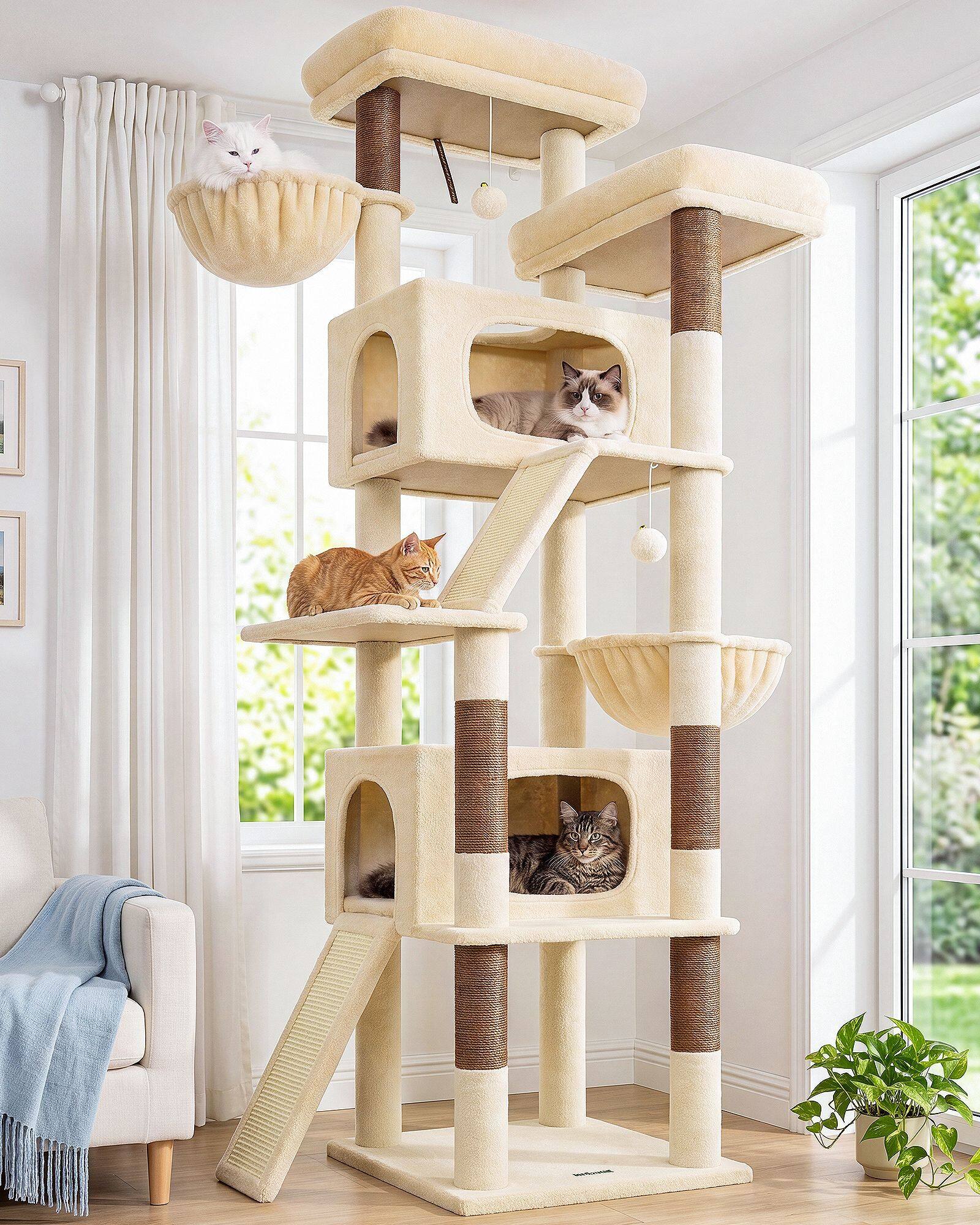
We kept a wall of foam-core elevations beside the sample table. Red lines marked footprint; blue lines marked sightline from the sofa. A concept that won on height but lost on sightline never advanced, even if cats would have climbed it. Early Globlazer discipline was room-first, cat-second—which sounds backwards until you remember cats live in the rooms owners already curated.
From modularity to height
Modularity taught us speed. Height taught us humility. Our first tall internal direction proved that silhouette and stability must be designed together—you cannot add inches at the top and apologize at the base later. Several tall paper stacks died in the one-hand test before we widened footprints as a rule rather than a patch.
Color came later than structure, which surprises people. We tried louder palettes early because the Industry Updates trained us to. Neutral beige, dark grey, and light grey won because they survived room photos from real apartments, not because they were safe. A concept board with coral plush looked energetic in the studio and exhausting beside grey sectionals in trial installs.
Sisal placement evolved from symmetric decoration to route mapping. Early concepts centered columns for photos; later concepts offset sisal toward entry paths once we watched cats ignore perfectly centered posts. That small shift appears on every current cat tree line—not as a spec bullet, but as a habit.
What survived those months became the spine of everything after: furniture-style lines, widened footprints, sisal placed on routes, fabrics judged like upholstery. None of it was a single eureka sketch. It was a wall of concepts with most sheets in the recycle pile—and a few lines that kept reappearing until they were undeniable.
Early concepts are not embarrassments. They are the compressed history of what Globlazer refused to ship until it felt planted in a real room. When we open the archive now, we still see the arguments we are having today—just drawn with cruder lines.
We still pin failed elevations beside current mockups—not as shame, but as comparison. The failed sheet usually shows height added before base width; the surviving sheet shows footprint drawn first. That wall is our cheapest teacher.
Early concepts also recorded assembly anxiety: towers that looked simple in CAD but shipped with bag counts owners dreaded. Simplifying module count became part of the same archive lesson as widening bases—respect the person assembling at 9 p.m., not only the cat climbing at 9 a.m.
The archive stays open for the next argument.