No products in the cart.

For a long time, pet products were expected to announce themselves. Bright colors, busy patterns, and shapes that read clearly as temporary accessories made sense when cat furniture lived in spare rooms.
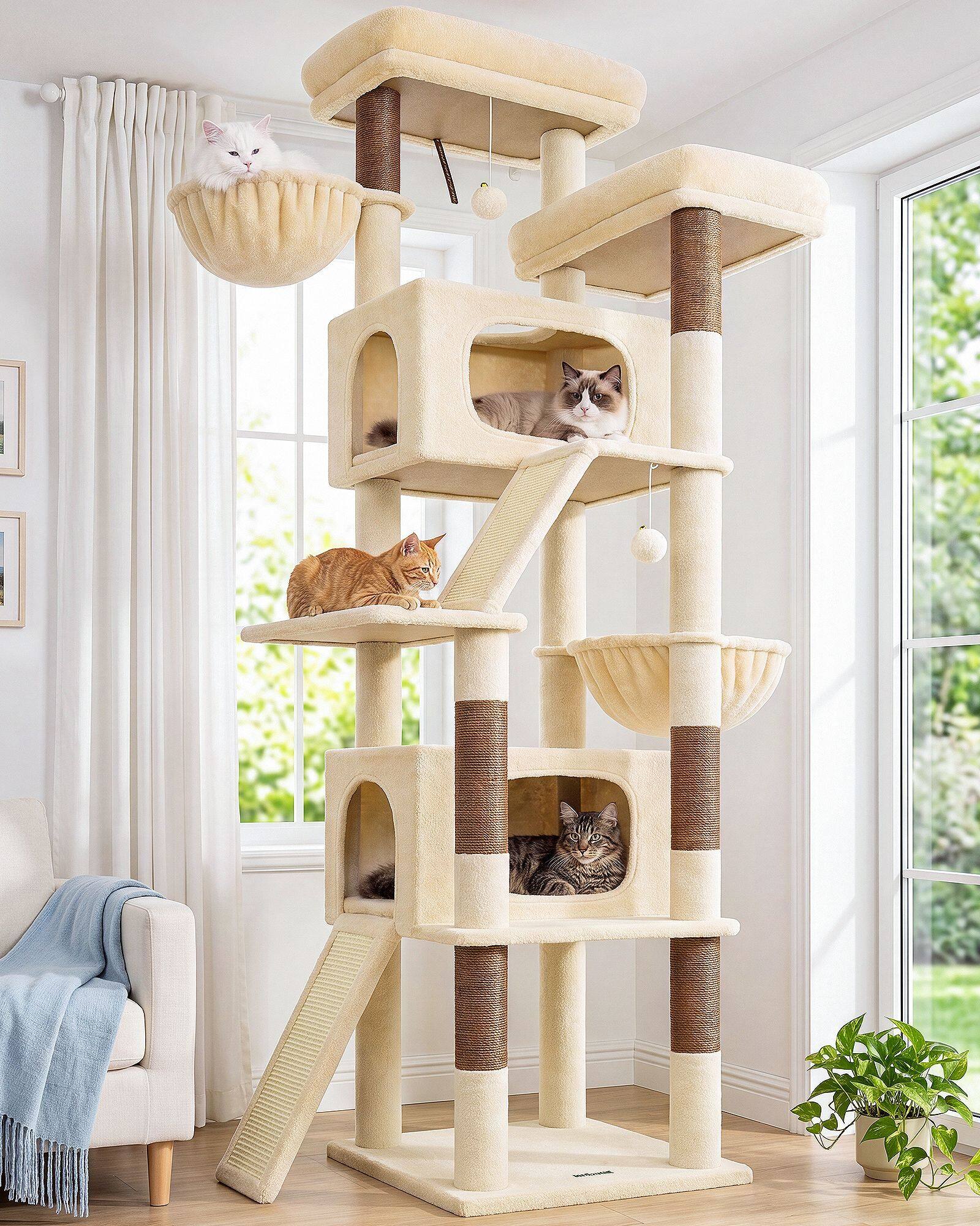
That expectation is reversing. As living rooms moved toward beige upholstery, soft grey walls, and quieter material palettes, pet products started being judged by a different question: does this belong in the photo of the room?
Neutral interiors did not simply prefer neutral cat trees. They changed the design brief. At Globlazer, our 2023 conversations kept returning to finish compatibility—how a tower sits beside linen, boucle, and matte wood without becoming the loudest object in the frame.
When the sofa sets the brief
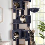
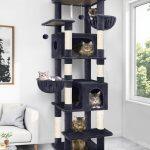
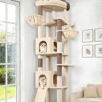
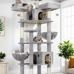
A tower that once won attention with contrast now has to earn placement beside curated textiles. Silhouette leads the shift: rounded platforms, slimmer columns, furniture-like proportions travel better through open-plan layouts than chunky forms that dominated early catalog photography.
Color follows the same logic. Beige, light grey, and dark grey are less about fashion than about compatibility with rental walls and transitional furniture. Two-tone towers—beige decks with dark grey posts—add depth without introducing a second decorating problem. Structure becomes visible; surfaces stay quiet.
Material choices tightened with the palette. Plush pile got shorter and more resilient. Decorative trim disappeared. Sisal columns began to read as structural details with visible weave, not emergency scratch patches in neon rope. We sample fabrics beside sofa swatches now, not beside pet-aisle carpet chips.
The reverse influence runs deeper than matching paint. When homeowners invest in calm surfaces and fewer visual layers, they become less willing to tolerate pet furniture that looks disposable. A neutral room punishes glossy polyester and carnival pile faster than it punishes claw marks on an honest sisal post.
Retail floors mirror the shift. Lifestyle photography places towers beside throw pillows and oak side tables; buyers compare nap direction and matte recovery the way they compare cushions. Pet products are being reviewed with interior standards—touch, proportion, longevity in the sightline—not with novelty alone.
Neutral interiors did not make pet products invisible. They made them grow up. A cat tree should feel like part of the room’s material story, not an exception to it. That is not minimalism for its own sake. It is respect for rooms owners already edited—and for cats who deserve routes that live in the best light, not the least embarrassing corner.
We felt the reverse influence in sample reviews. Coral plush that energized a studio wall exhausted a grey sectional in trial installs. Mist-grey sisal beside white trim read as intentional; printed carpet posts read as imports from another shopping aisle. The room vetoed options the catalog once celebrated.
Lighting exposed the same filter. North-facing rentals punish shiny pile; south-facing lofts punish colors that fight afternoon sun. Neutral platforms survived both because they borrowed the room’s existing light story instead of inventing a second one. Owners stopped asking whether the tower matched the cat. They asked whether it matched the room they already finished.
Edge cases taught us the same lesson. Towers beside gallery walls need quieter contrast than towers beside busy patterned rugs. We keep two neutral families in sampling—not because owners cannot choose color, but because rooms already did. The product’s job is to agree.
Globlazer’s direction assumes the sofa sets the brief before the catalog does. When beige and grey platforms survive three decor refreshes beside the same sectional, we know the reverse influence worked. The home trained the product. The product finally listened—and cats gained routes in better light because the tower was allowed to stay there.