No products in the cart.

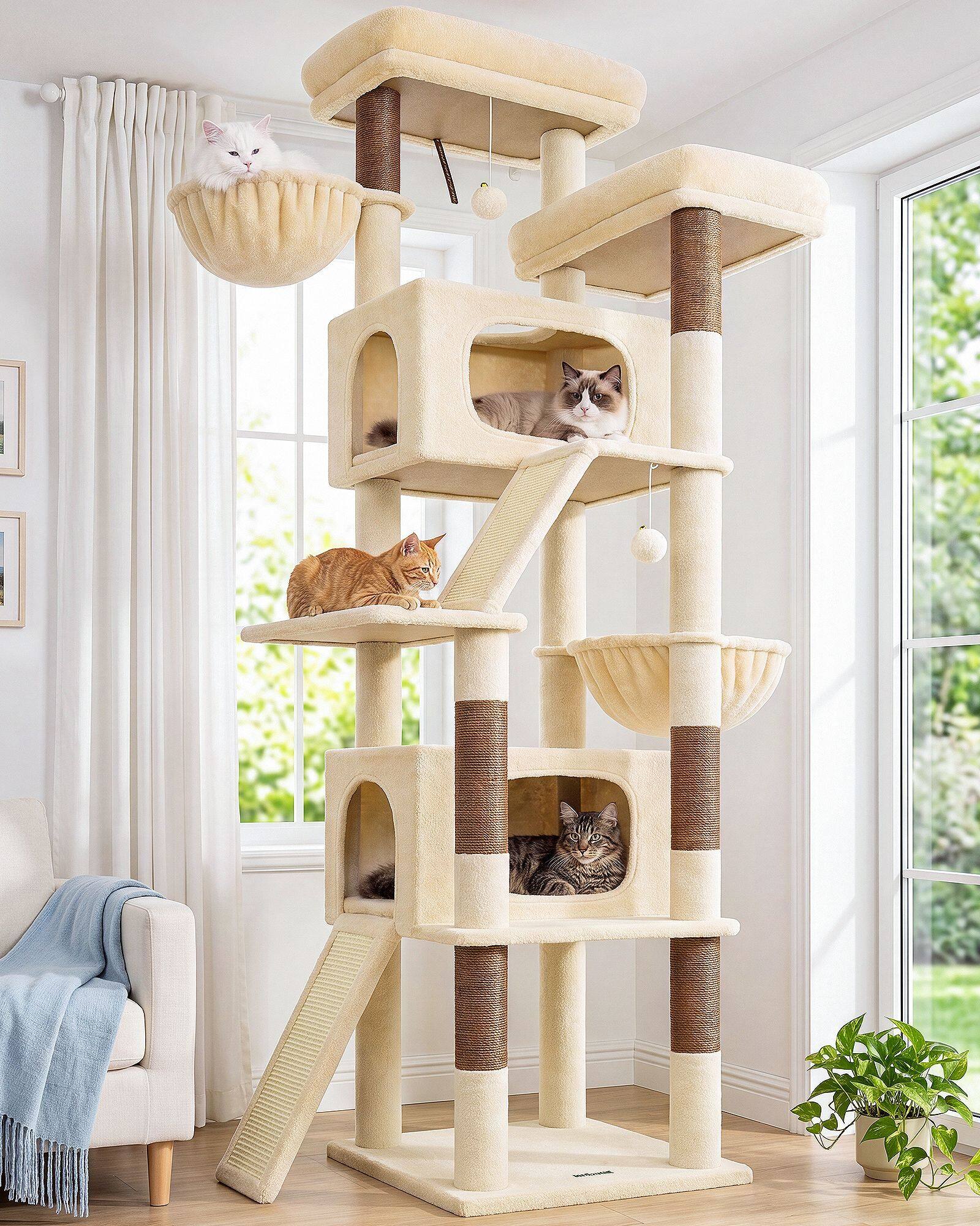
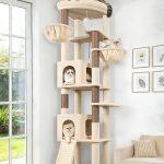
Walk through any modern living room photo and you will see the same quiet palette repeating: cream walls, grey or beige upholstery, wood tones that do not compete. Cat furniture finally learned the same vocabulary—and beige with soft grey became the colors owners request most often when they describe their rooms.
At Globlazer, those neutrals are not accidents of inventory. They track a broader home trend: warm minimalism replacing cold, high-contrast interiors. Design media describe beige and grey as forgiving finishes. They travel across rental white walls, transitional sofas, and oak floors without forcing a redesign. For a cat tree, that forgiveness matters because the tower is large—it cannot hide in a closet when guests arrive.
Most buying decisions start with matching, not mood boards. Owners screenshot their sofa fabric, compare swatches beside a platform sample, and ask whether mist grey reads too cool against linen. Beige and soft grey win because they answer those questions with fewer apologies. Industry Updates observation keeps returning to the same behavior: people choose the sofa first, then hunt for a cat tree that whispers instead of shouts.
Warm minimalism put those tones back in charge—not as passing trends, but as the calm default modern rooms expect. Mocha walls, oatmeal textiles, and soft greys on rugs set a palette pet products ignore at their peril. When living rooms went earthy and warm, loud pet carpet looked like it time-traveled from a louder decade.
Open-plan layouts raise the stakes further. When kitchen, desk, and sofa share one sightline, a saturated pet tower becomes a daily argument. Neutral towers buy peace—they let cats keep the best vertical real estate without starting a color war. Housing trends toward edited objects also help: one calm cat tree replaces three loud pieces that used to clutter a rental corner.
Photography reinforced the preference in ways owners feel even if they never articulate them. Neutral plush photographs calmer in daylight, hides everyday fur more gracefully, and survives social crops beside real furniture—not novelty pet carpet. Platforms in cream and grey read like ottomans in room shots; that visual parity matters when the tower sits in the main view.
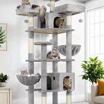
Texture variation keeps neutrals from feeling flat. A beige platform with charcoal sisal, or a soft grey wrap over warm wood posts, adds depth without breaking the palette. European and North American housing both reward that restraint—rental whites, oak floors, and linen sofas repeat the same quiet story across markets.
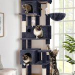
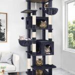
Layered combinations—beige bodies with charcoal posts, light grey platforms with honest sisal weave—keep towers from feeling flat while staying inside the room story. Globlazer explores two-tone wraps and seasonal fabrics, but BG, DG, and LG neutrals remain the backbone because they match how people already live.
Cat behavior still wins when color quiets down. Owners report more platform use when the tower feels like part of the room—beige and soft grey remove the spare-room exile that loud carpet encouraged.
Soft minimalism made beige and soft grey feel intentional rather than default—edited rooms treat them as design choices, and cat trees that share those choices look deliberate.
Retailers mirror that logic on shelves. When beige and soft grey lead the assortment, the tower stops fighting the throw pillows in the same photo—and the cat tree finally looks like it was planned, not rescued from a clearance corner.
Beige and soft grey dominate because they solve a household problem: how to add height for cats without redecorating for cats. That is a design outcome—quiet color doing the same job as a well-chosen rug. The market did not fall in love with beige because it is safe alone; it fell in love because safe, in modern homes, is what belonging looks like.